responsive posts

Givecamp 2014: Lake Erie Ink

Lake Erie Ink mobile home page
Slightly over a week ago, I finished my fourth Cleveland GiveCamp. GiveCamp is a weekend of developing websites and other things for area nonprofits. As usual, it was a good time. My project this year was an update to Lake Erie Ink’s site. They had actually had their site built at the GiveCamp two years prior (I was not on that project, but know someone who was). They just wanted a map added to their site that showed where kids were writing or writing about. With six developers and a developing project manager, along with a WordPress plugin, we were able to get the basic functionality working rather quickly. So quickly that we had something working Friday night and started shedding developers to other projects. By Sunday it was basically down to just me and the project manager (plus the Lake Erie Ink people, of course). We added in some extra improvements in addition to the map. We brought in a couple of designers for brief stints to help us with some design issues.

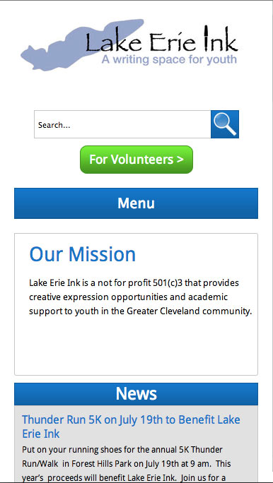
For my part, I did help some with the map, but spent most of my time making their site responsive and tweaking the home page to include a callout for the map page. The site had not been designed with responsiveness in mind at all. It had nested divs with fixed pixel widths that accommodated padding of the parents’ even when width: 100% would’ve done the same thing. In addition, id’s were used a lot, even multiple times per page, there was a lot of unnecessary redundancy and extra CSS in the styles (such as repeated blocks and things like margin: 0px 0px 0px 0px), and extra heading elements were made up to provide extra heading styles (h7, h8, and h9). The templates were confusing at times and some had different versions or nearly identical related templates.

Continue reading post "Givecamp 2014: Lake Erie Ink"

Responsively Changing Date Formats

At times in developing a responsive site, the content that is shown needs to change depending on the viewport. One might want to show a hamburger icon instead of a menu on a small viewport or display extra less critical content on a larger viewport. I recently had to show a more verbose format on wide viewports (like “Tuesday June 8, 2014”) and a less verbose date format (like “Tue Jun 8, 2014”) on a narrow viewport to make things fit well. I didn’t like the options I’ve used in the past. I didn’t want to have duplicate content in my raw markup, to need to inject HTML elements into generated date strings, or to involve JavaScript. I tried fixing the width of a wrapper and hiding the rest, but with the non-monospaced font, it didn’t work the same for all cases.

So I did some looking for other options. I found a discussion of a technique that seemed fairly elegant. I had been reluctant to use it in the past because of browser support and just being a bit uncomfortable with it. The technique makes use of the attr() expression to inject content. Since any browsers that support media queries should support attr() and I was using this in a media query, I thought it worth it to embrace it finally. I liked the results and will probably make more use of it in the future, especially since the browsers that don’t support it now have low enough market share to almost ignore.

Continue reading post "Responsively Changing Date Formats"

Responsive Behavior

Styles (ie CSS) are the primary focus when it comes to making a site responsive, but the behavior (ie JavaScript) must also be able to react differently to different circumstances. A site might have a horizontal navigation with drop-down menus for wider viewports, but a simple vertical slide open and closed navigation for narrow viewports. The site must not only be able to change the styles that make those menus look right but also the script that drives the behavior. Some behavior might even need to manipulate that DOM to function properly, such as sliding banners with inserted navigation. The DOM will need to be changed one way for certain viewport sizes and those changes reverted, and possibly other changes made, when switching to different viewport sizes.

One might contend that most viewers won’t be switching their viewport dimensions, but window resizing does happen, text can be resized (for ’em’ breakpoints), and mobile devices can be rotated. The site should not break when this happens. Also, even without changes, the correct behavior must be run.

For dealing with this, I have created a ResponsiveHandler class that listens for resizing of the window and fires an event when changing breakpoints. For each behavior that needs it, I listen for this event and run the appropriate construction and destruction depending on what the new and old breakpoints are/were. Behaviors can also simply use the class to determine which breakpoint the site is currently in and act accordingly.

Continue reading post "Responsive Behavior"

Responsive: Turn Image Maps Into Selects

I’ve been doing quite a few responsive sites since I first started into them. I like doing them. They are fun to build, requiring new techniques and a different way of thinking to handle different situations. I like the concept and I like looking at the sites. One recent fun thing was dealing with an image map. Scaling the image and coordinates would be a pain and very expensive. An alternative option is to replace the image with a select drop down when the screen is too small for the image.

Breakpoint detection

I don’t remember where I found this method of dealing with breakpoints in JavaScript, but I’ve been setting the line height on the html tag with media queries and reading it with JavaScript to determine which breakpoint I’m in. This works with the ’em’ based breakpoints I use. I convert the numbers to more descriptive names, such as ‘small’, ‘medium’, and ‘large’. It looks something like this:

Continue reading post "Responsive: Turn Image Maps Into Selects"

My first responsive site

I’ve been interested in the basic idea of responsive design since I first started into web development. Back then it was mainly limited to flexible widths that accommodated changing screen widths and font sizes. I experimented with that when development was just a hobby. Still, I found CSS2 and browser compatibility issues to greatly limit the flexibility. When starting to actually get paid as a developer, I went with what was already being done at the places I worked, which was pixel-perfect design. Sites had to work in old browsers and time was limited. Designs were flat images that were easy to cut up and use CSS to match exactly. I did play with some flexibility when I had more free time.

When responsive design became a thing, I thought it looked pretty awesome. It gave a lot more flexibility than what I had been playing with. Still, browser support was too bad for parts of it for me to use at work. I played with some aspects of it, adding a bit of flexibility here and there, but still kept mostly with the pixel perfect type design. When we eventually discussed it with my boss, he didn’t like the idea, particularly for accommodating his designs and the browser support issues. I started a yet unfinished remake of my own site that allowed me to play much more, but didn’t get very far towards a finished design.

The Site

Recently, my boss came up with a simple design for a simple site that he thought would be perfect for trying responsive techniques with, the annual report for the Gay Community Fund. It lent itself well to flexibility and him and the client were fine with graceful degradation / progressive enhancement. It consists of basically two layouts: the home page, with a gallery layout of boxes; and an internal layout with a heading, a possible image, a possible small image gallery, and a possible long list.

Continue reading post "My first responsive site"

Workings of Late: Symfony, Less, Responsive Design, Etc

As I’ve mentioned, at Cogneato we’ve been building a new version of our CMS using Symfony on the server side. I’ve spent a LOT of time with Symfony now. I like it and will be using it for some other projects outside of work as well. We’ve been working on some eCommerce type sites that will hopefully be launched in the coming months, while building the system that all of our sites will eventually run on.

Though I like it, there have been many challenges to deal with, especially with making Symfony work with our old system. We have way too many existing sites with more than enough custom programming to convert them completely to a new system, so we’re setting it up so that both can be run side by side on old sites, while new sites will eventually only need the new system. But it has been a lot of effort to get the two working together properly. Symfony is inflexible in some ways, and not well documented in some areas. I intend to, in the coming months, write about my solutions for the various issues we’ve dealt with.

Continue reading post "Workings of Late: Symfony, Less, Responsive Design, Etc"