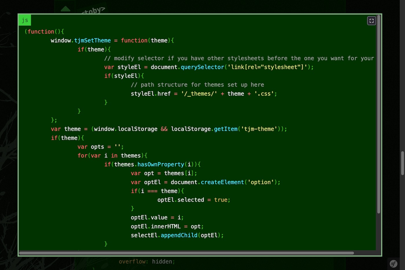
My blog has a lot of code blocks, as programming for web development and shell scripting is a frequent topic. Some of the code blocks can get long and require scrolling. To improve their readability, I decided I wanted to do something like a breakout, where the element can go wider than its container, but only when the user wants it. I settled on doing a popover type dialog box when a button is clicked. Since this was sort of a combination of a breakout and popover for user purposes, I dubbed it a breakover. I built a simple JS solution for my site with a bit of CSS to improve the appearance.
I wanted to keep things simple, so I only built support for browsers that support the Popover API. It is somewhat new (baseline 2025), but older browsers can still read the code in place, as it had been before. With the Popover API doing the heavy lifting, the JS is relatively simple. It:
- tests for browser support
- finds all code blocks, loops through them.
- for each, adds a button, to toggle the Popover API on the containing element
The code looks something like this, as a JS module:
var doc = document;
var body = doc.body;
if(body.querySelector && body.showPopover){
	var main = function(container){
		if(!container){
			container = body;
		}
		var els = container.querySelectorAll('pre:has(code)');
		els.forEach(function(el){
			el.setAttribute('data-breakover', '1');
			var toolbar = el.querySelector('.toolbar');
			if(!toolbar){
				toolbar = doc.createElement('div');
				toolbar.classList.add('toolbar');
				el.insertBefore(toolbar, el.firstChild);
			}
			var btn = doc.createElement('button');
			btn.classList.add('breakoverAct');
			btn.innerHTML = '⛶';
			btn.title = 'Expand';
			btn.addEventListener('click', function(){
				if(!el.popover){
					el.setAttribute('popover', 'auto');
					el.showPopover();
					el.setAttribute('data-breakover', 'open');
				}else{
					el.hidePopover();
				}
			});
			el.addEventListener('toggle', function(e){
				if(e.newState === 'closed'){
					el.removeAttribute('popover');
					el.setAttribute('data-breakover', '1');
				}
			});
			toolbar.appendChild(btn);
		});

	};
	if(doc.readyState === 'loading'){
		doc.addEventListener('DOMContentLoaded', main);
	}else{
		main();
	}
}else{
	main = function(){};
}
export default main;
The minimum CSS is fairly straightforward. The browser generally handles the popover styles, but I make them explicit and use my own sizing limits. The button / toolbar can be positioned on the top right of the container. A minimal implementation could look like:
[data-breakover]:popover-open{
	margin: auto;
	max-height: 90vh;
	max-height: 96dvh;
	max-width: 90vw;
	max-width: 96dvw;
	overflow: auto;
	position: fixed;
	@media screen and (min-width: 32em){
		max-height: 90vh;
		max-width: 90vw;
	}
}
.toolbar{
	position: absolute;
	right: 0;
	top: 0;
}
Add styles for the button and popover container to match with you site's theme.
I like the result. It keeps the code blocks fitting in the regular document structure normally, but allows viewing them in a larger container for easier perusal when desired. I have created a minimal demo of this breakover implementation in my demos area to more simply demonstrate it.