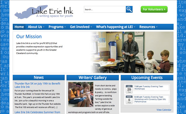
Slightly over a week ago, I finished my fourth Cleveland GiveCamp. GiveCamp is a weekend of developing websites and other things for area nonprofits. As usual, it was a good time. My project this year was an update to Lake Erie Ink’s site. They had actually had their site built at the GiveCamp two years prior (I was not on that project, but know someone who was). They just wanted a map added to their site that showed where kids were writing or writing about. With six developers and a developing project manager, along with a WordPress plugin, we were able to get the basic functionality working rather quickly. So quickly that we had something working Friday night and started shedding developers to other projects. By Sunday it was basically down to just me and the project manager (plus the Lake Erie Ink people, of course). We added in some extra improvements in addition to the map. We brought in a couple of designers for brief stints to help us with some design issues.
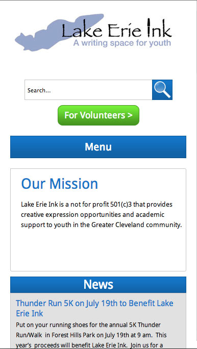
For my part, I did help some with the map, but spent most of my time making their site responsive and tweaking the home page to include a callout for the map page. The site had not been designed with responsiveness in mind at all. It had nested divs with fixed pixel widths that accommodated padding of the parents’ even when width: 100% would’ve done the same thing. In addition, id’s were used a lot, even multiple times per page, there was a lot of unnecessary redundancy and extra CSS in the styles (such as repeated blocks and things like margin: 0px 0px 0px 0px), and extra heading elements were made up to provide extra heading styles (h7, h8, and h9). The templates were confusing at times and some had different versions or nearly identical related templates.
I slowly worked through cleaning things up (not strictly necessary, but made it easier), converting widths to percentages, and adding breakpoints. I left the dropdown menu script they had in place and added a small amount of JavaScript and some overriding CSS (including some !important) to override it on a narrow viewport. The header in general was probably the toughest single part. It had a logo, a search box, a button, and the three level nav. I ended up stacking things as the viewport shrunk, which I haven’t done in a header before. For the multilevel nav, I left all levels open as a long vertical list once the menu was open. Getting the content boxes that’re on the home page and a couple other pages away from pixels to widths and away from ids to somewhat DRY classes also took some time. I also, of course, had to check every page to find any one-off or less common things that needed special styling. With the limited time, I didn’t do in depth browser testing, but I wasn’t doing anything unusual and it looked good at a quick glance.
I was fairly happy with what we accomplished over the weekend. The map is a neat addition to their site and will hopefully get used and achieve its goals. The responsiveness probably would’ve been better if the site was designed with it in mind from the start, but I think it turned out pretty well. Hopefully it brings in more visitors via mobile and makes it easier for them to do what they came to the site for. The navigation especially will be easier because the desktop dropdowns were completely inaccessible to touch.
As usual, I camped the two nights of the event. I bought a new one man tent since I haven’t had anybody to share my four person tent with this year or last and I’m not sure if my hammock tent would be usable. I got the Eureka Midori. It served me well, managing the rain on Saturday just fine and providing plenty of space for how small it is.
The other reason I bought a lightweight tent was that this year I wanted to take public transportation to and from the event. I live maybe a half mile from a rapid station. I walked to and from the station, and took the rapid downtown. On the way there, I took a bus part of the way too. Google Maps took me way to the far corner of the airport, which was about a mile from where the bus dropped me off. Luckily, a fellow GiveCamper whom I recognized from the past picked me up and took me the rest of the way. I also got a lift to the much closer rapid station on the way home. All in all, the public transportation thing was a success. Next year I will not be living in the same place, but I will do it again if it’s still reasonable.