I had to make a toggle switch widget for work recently. I had not done one before, having used built in or custom check-boxes for that purpose. My boss thought the switch would better fit a simple “form” that turns off and on a single setting though, so I made one.
I looked at some examples, but didn’t necessarily like some aspects of them. For instance, I don’t really like how Zurb foundation’s switch uses the <label> in a way different from normal form labels. Some had keyboard / accessibility issues. I took ideas from them and built something I like.
My solution requires specific markup, with a wrapper element containing a checkbox and an empty additional element. Beyond that, it only requires CSS, and falls back to a checkbox for non-supporting browsers. It uses the checkbox element directly, so it gets the keyboard focus with outline and accessibility functionality automatically. It puts the visual switch over the checkbox and uses pointer-events: none to allow clicking through to the checkbox. The :checked pseudo-class allows styling the switch element based on checked state.
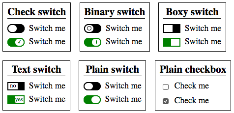
The one I made for work was done with a boxy shape and the text “on” or “off” displayed in the non-“switch” part of the widget. For this article I made it a little differently, in part because of different circumstances and personal preferences. I use a check-mark on the switch as a non-color indicator of the checked state.
The markup looks like:
<div class="switchField field">
    <span class="fieldWidget">
        <input class="fieldControl" id="f-switch" name="switch" type="checkbox" />
        <i></i>
    </span>
    <span class="fieldLabel"><label for="f-switch">Switch me</label></span>
</div>
This is generic form field markup I use to handle most form styling needs, plus an <i> element necessary for the visual switch.
The styles look like:
*{
    box-sizing: border-box;
}
.field{
    display: flex;
    align-items: center;
    justify-content: left;
}
* + .field{
    margin-top: 0.5em;
}
.switchField .fieldWidget{
    /* label gap */
    margin-right: 0.5em;
}
/* only apply if we can ensure switch won't block input functionality */
@supports (pointer-events: none){
    /* switch styles */
    .switchField .fieldWidget{
        /* inline */
        display: inline-block;
        vertical-align: middle;
        /* sizing */
        height: 1em;
        width: 2em;
        /* allow internal positioning */
        position: relative;
    }
    .switchField .fieldControl
    ,.switchField .fieldWidget > i
    ,.switchField .fieldWidget > i:before
    {
        border-radius: 1em;
    }
    .switchField .fieldControl, .switchField .fieldWidget > i{
        /* cover container */
        height: 100%;
        left: 0;
        position: absolute;
        top: 0;
        width: 100%;
    }
    .switchField .fieldControl{
        /* get rid of checkbox look & styles, allow resize */
        -moz-appearance: none;
        -webkit-appearance: none;
        appearance: none;
        margin: 0;
    }
    .switchField .fieldWidget > i{
        /* off colors */
        background: black;
        border: 2px solid;
        color: black;
        /* allow click through */
        pointer-events: none;
    }
    .switchField .fieldWidget > i:before{
        content: '';
        /* colors */
        background: white;
        /* sizing */
        bottom: 0;
        position: absolute;
        top: 0;
        width: 55%;
        /* position */
        left: 0;
        transition: left 0.1s ease;
    }
    .switchField .fieldControl:checked + i{
        /* on colors */
        background: green;
        color: green;
    }
    .switchField .fieldControl:checked + i:before{
        left: 44%;
    }

    /* check mark */
    .switchField .fieldWidget > i:after{
        /* animate */
        transition: left 0.1s ease;
        /* content */
        content: '';
        font-size: 0.6em;
        font-style: normal;
        /* position */
        height: 100%;
        line-height: 1.5;
        position: absolute;
        left: 68%;
        top: 0;
        z-index: 1;
        /* help friendly screen readers */
        speak: none;
        width: 0;
    }
    .switchField .fieldControl:checked + i:after{
        content: '✓';
        left: 22%;
        speak: none;
    }
}
I block the switch styles for browsers without pointer-events to prevent it from failing to click through. The support is effectively the same as @supports support, which is modern browsers for a few years but no IE. IE 11 would support this without the @supports wrap, but then IE 10- and really old versions of other browsers would have inoperable inputs.
I did try some things for full older browser support. I could position the input over the switch, but the checkbox would then be visible overlaying the switch in browsers without appearance: none support. I could then set opacity: 0.0001 or the like, but then the focus outline wouldn’t be visible for keyboard access.
In order for the switch to animate, I position it off the one side. This means that it might be slightly off perfect alignment when in the on position. It could be aligned perfectly without the animation. Also, any of the textual / glyph based content displayed on the switch is positioned based on dimensional aspects of the font being used and thus the position may be off with different fonts. An image could be used instead to deal with this.
See the demo with this and other variants.