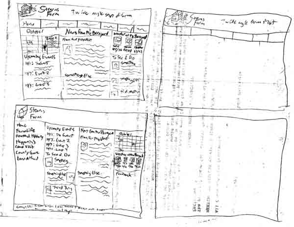
We made some wireframes for the planned layout of the Stearn’s site. We were supposed to consider theme in these as well, but we all worked mostly on layout.
 I started with a few ideas in boxes that would later be moved to printed, properly proportioned boxes. I liked the layout we had been working with in the wireframes we had done in that Oversite program, with the buttons along the top and sub navigation in the side bar, so I started with that. In trying to make another type of layout, I went with an accordion menu in a sidebar.

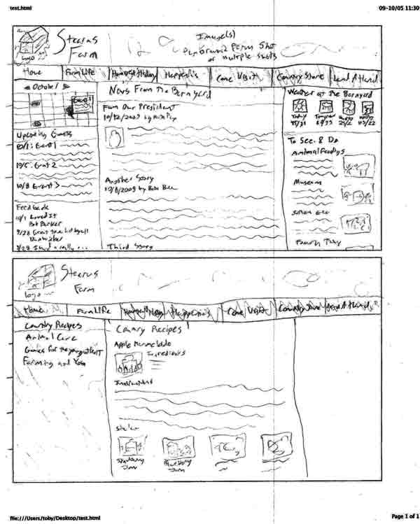
I then began moving the layouts to the properly sized boxes as “final” versions. This is the one with the button bar at the top, with a home page version and another page version that has the side sub navigation

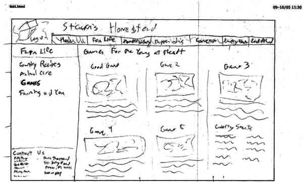
This is a slight change to the button bar layout with a shorter width top bar and the footer as part of the side bar. I only did one, as it was otherwise to be similar to the other button bar example.

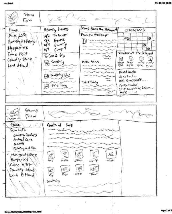
This is the accordion side bar layout. The four column home page is very busy, but I was trying to keep everything above the fold. It will probably drop a column and have some stuff drop below the fold in the future.