Over the past couple weeks we've been working on our mockups for the site design for Stearns. We each picked one or two of our wireframe concepts and have used Adobe Photoshop or Fireworks to create the fleshed out, full color and image versions of them.
I used Photoshop, since I'm familiar with it and have never dealt with Fireworks before (hadn't even heard of it till this class). As a non-designer, it took me a long time to do. I tried to keep every piece separate and organized to make it fully modifiable. This can be painful in Photoshop though, especially since you can't modify some aspects of multiple layers at once. And with all those little bits, they really bogged down even the powerful computers at school at times.
My version of Photoshop at home is old (7), so I couldn't really work on them there. Some of the stuff from CS4 didn't fully translate, I don't have all the fonts, and Photoshop 7 didn't have the nested layer groups and other benefits that I was heavily using to keep organized and work on this thing. I had to spend extra time at school and at my parents (my Mom has CS4).
Next time, I think I'll be faster at this, as I know more what I'm doing, how to deal with all those pieces and what not. Hopefully also I'll be better at making a good design. I'd like to learn that Fireworks, as it looks much better for this purpose. I think it even makes it very easy to convert the mockup into actual HTML and CSS for the live site, which could save a lot of time with that.
So finally, my mockups. I did two of my ideas, plus a modification of the one. There are two pages for each. They all have very similar (copied and then slightly modified) content sections. They were all designed to be about 975 pixels wide and with 600 pixels as the above the fold height. They have an additional 200 pixels of width to show the sides and as much as 600 pixels below the fold of height for content.
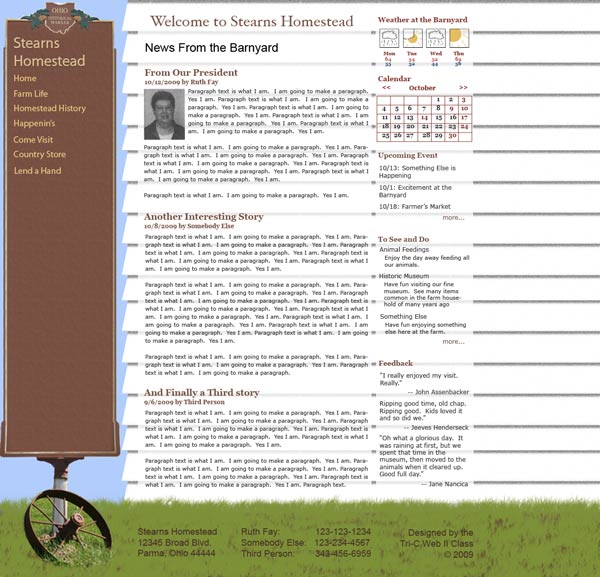
This design used the historic mark that Stearns has, as well as one of their houses, as the major design components. I used an actual image for the sign, cutting it to build the height. I “drew” the siding and grass in photoshop. The menu is very wide, giving the main content less width to work with, though it does have a lot of height since there is no header.
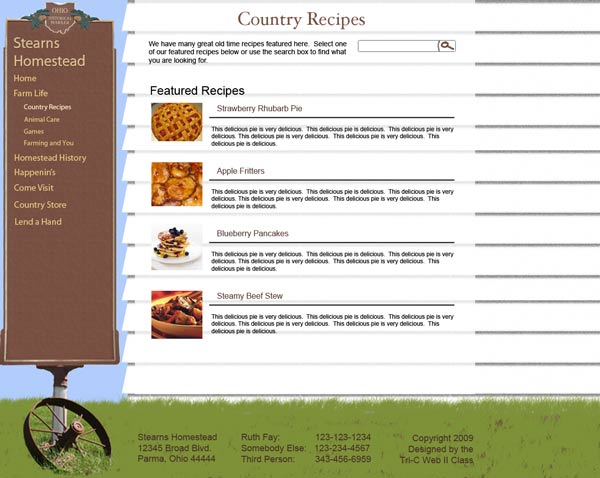
The recipe page for the sign & house design. I had started designing with the recipe page for all my designs, and built the home pages later.
This design is supposed to be an open barn door, though the door itself is not visible, only the doorway. There is a sign overhead. Due to the suggestion of the instructor, I put it right on the door frame instead of above the frame to conserve space and make it cleaner. Putting the text on the animal silhouettes doesn’t look that clean though, so the instructor didn’t want me to present this one. I like the fact that it allows for a three column home page, though, giving lots of real estate above the fold.
The recipes page of this design. I figured the recipes would each be a separate page on the site, with either links to featured recipes or categories on the main page and a search box to find recipes. I drew the search icon in Photoshop on the suggestion of my classmates, as they didn't like the text button I had. This, like most of my content elements, was used on all designs.
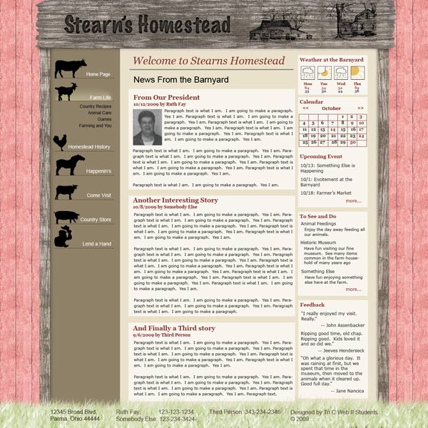
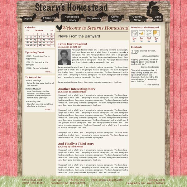
This was a modification of the other door design, at the suggestion of the instructor. It has navigation on the side, with accordion style drop down sub-menus. It took a lot of effort to get the icons looking good on the side. I tried various things with the icons themselves, such as having them bigger with the text on them (had to be huge to work) and using just their head sticking off the side (didn’t really work). I also, with the help of the instructor, tried various positionings of the text. I think the final version looks pretty good, though still perhaps a little uneven.
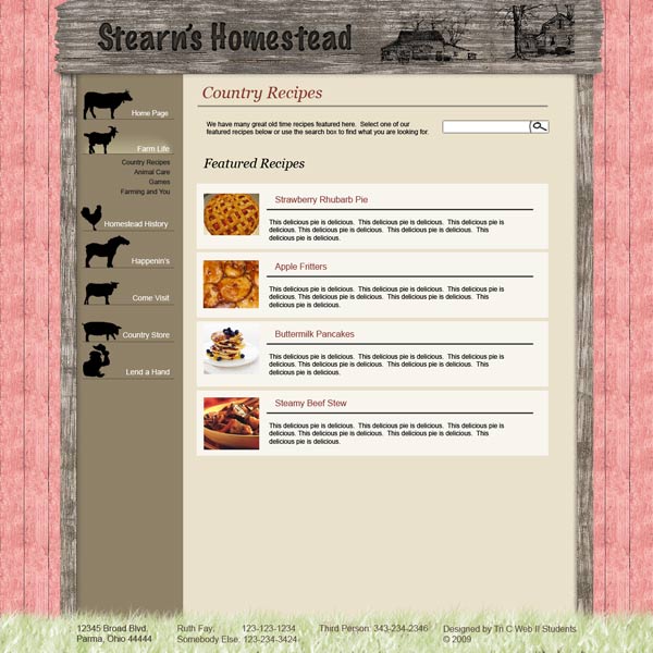
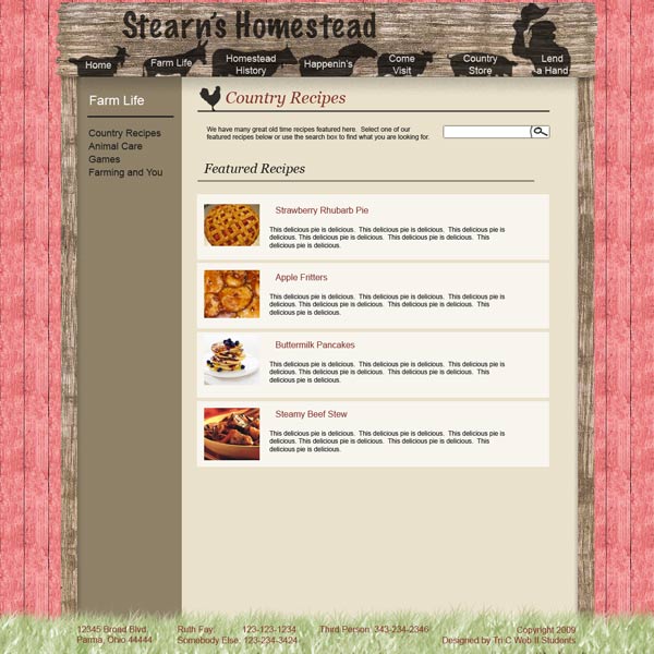
And the recipe page for the side navigation door design. For the sign, I attempted to make a burned in look for the text and an etched look for the images. I didn’t quite figure out how to make a good burned in look. There were some tutorials on line, but they weren’t quite what I had in mind.